Waves Capital Partners
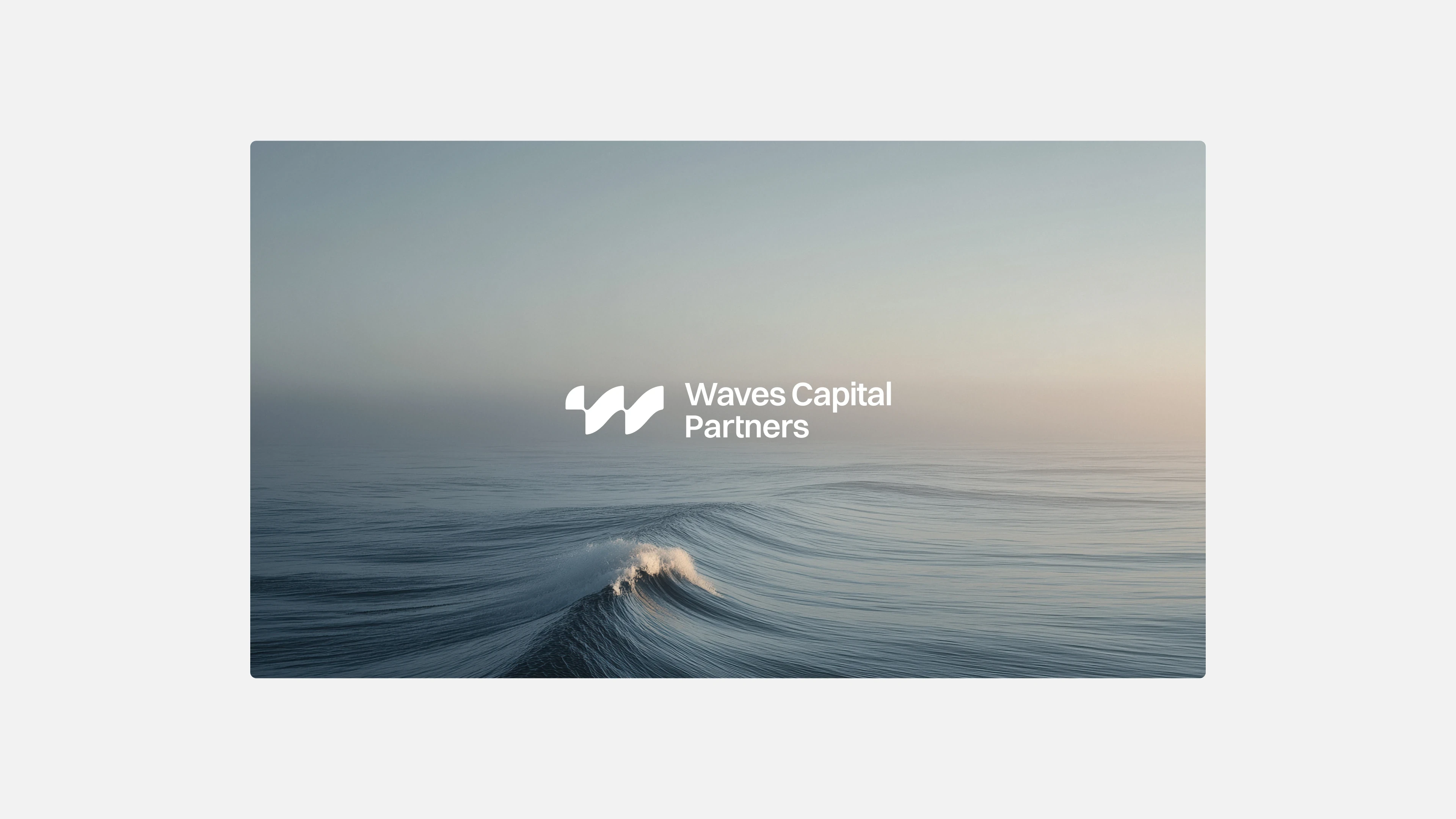
How can a capital firm express what makes it different : a financing model built entirely around flexibility? The challenge was to shape an identity that feels as adaptable and founder-aligned as the way Waves actually invests.
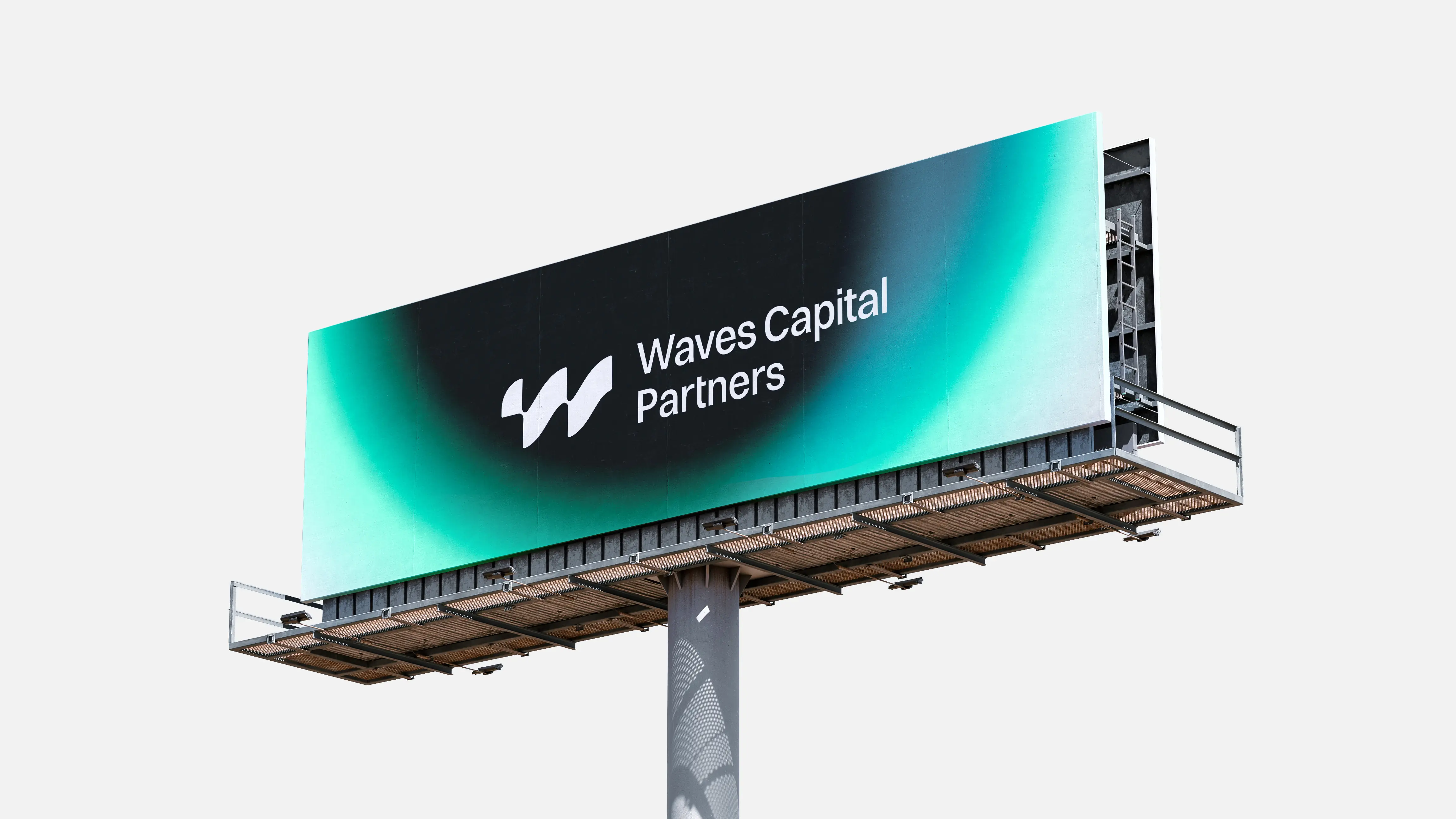
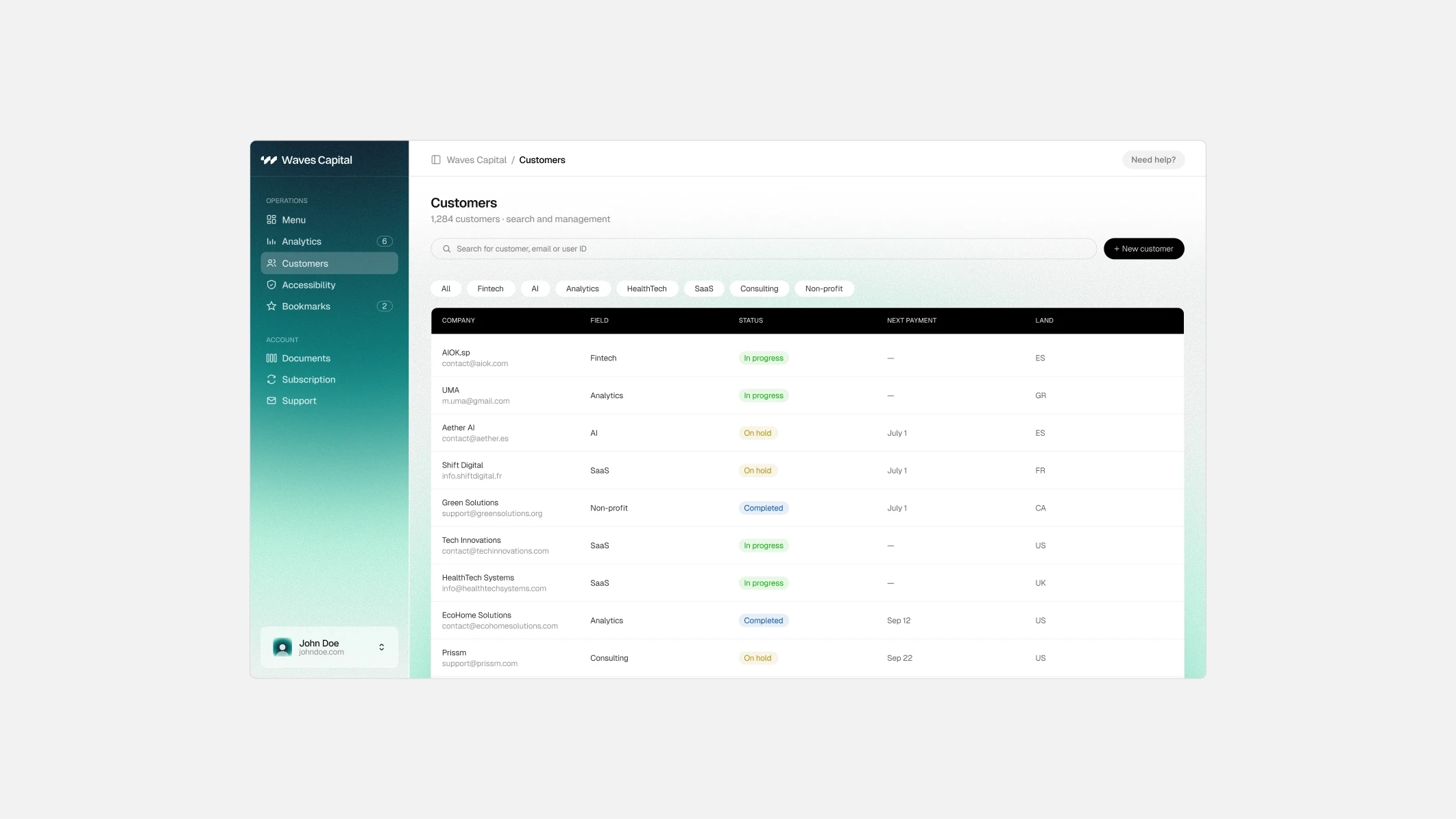
The logo turns this idea into a single, fluid mark, while a deep oceanic palette and soft gradients bring warmth and approachability to a sector that rarely allows it. The result is a brand that feels flexible, patient and human. This work has been done during my time at BORING
BRANDING